Aqua Tube
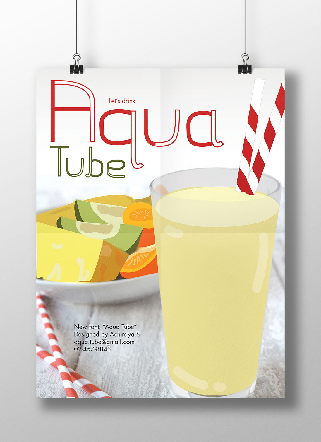
To begin with, before I can produce this poster, I needed to find my most interesting object to be able to design the new creative fonts that is never publish and seen before. I chose “Straw” because I think that it will be very interesting and unique objects to design a new font, which will not be similar to other cliche fonts. I designed one part of font to have typical shapes, but another unique part of font I inspired by the shape and look of straws, which most of them are white, a little thick and unique curve line. In order to design the font, I made that unique part to have white space and put black outline to be similar as straw. Additionally, this poster is all about straw. When you think of straw, you will definitely think of drink to be the first choice. Therefore, I decided to use drink and some food to be the big poster to make the viewers think when they have dinner or lunch, they will have some drink. The thing that cannot be missed is straw to go together with the drink. When the viewers see the poster first, they can guess and notice what I will communicate to them on the other pages. I also put some real straws decorating on pages to make the audience refer the fonts with the shape of real elements. I chose the name “Aqua Tube” to be the name of my fonts is because Aqua means the water, and Tube is a similar word of straw, so the meaning of the name also has already communicated about the concept of poster and font design.